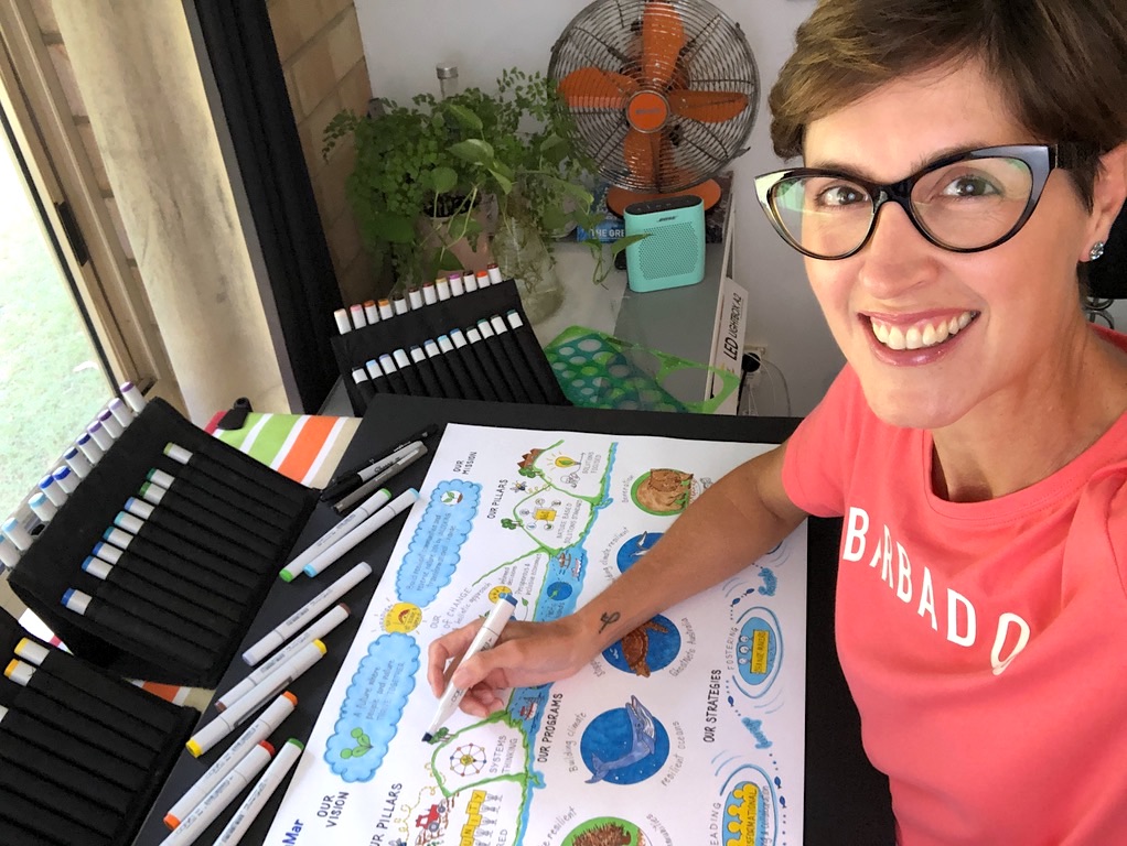
Infographics & Illustrations – words and pictures for people

I love bringing people’s stories and strategies to life through words and pictures, and creating tailored infographics and illustrations is such a powerful way to draw attention to your story. Infographics are like mini ‘visual stories‘ combining text and graphics to visually communicate often complex issues, data, information and perspectives. Today we are bombarded by digital information and data so infographics are a great way to simplify the complex, draw attention to and tell your story.
For me, visualising information as infographics is a strategic thinking tool as strategy is complex, abstract and collaborative, so visualisation helps to make complexity visible, identifies gaps and connections, creates a shared language for stakeholders and an understanding of the ‘big picture’ immediately. So strategic visual facilitation is more than drawing, the drawing is just the medium used to capture and convey the information. Infographics are also a great strategic engagement and communication tool as the visual enables stakeholders to see themselves in the picture, be on the same page (literally) and move from complexity to clarity and from discussions to decisions. I just love the power of visuals.
Below are a range of examples of how I use strategic visual facilitation to create tailored infographics to suit your audience and visual needs – from drawing out the big picture of strategic plans, stakeholder workshops and internal communications to drawing out the complexities of marine and environmental research, First Nations knowledge and stories, natural resource management programs and industry practices to illustrating workshop templates, funding proposals, visual aids for interviews and visual biography’s and even animated stories… AND time-lapse videos of these drawings are also a great way to “picture your ideas” in an engaging and fun way.
To me a great infographic cleverly uses words and pictures so the message and information is easy to understand. An eye-catching infographic or wall mural can also be like ‘eye candy’ for the eyes, and brain too!! Clear and simple illustrations can also help to capture the message, idea or concept you are trying to communicate in presentations, online platforms, reports, proposals, posters, templates, journal articles or even to display on your office walls.

When I picture your ideas I help to make the complex simple and the simple compelling and I can picture any idea, topic or concept with some examples below. Artworks can be created from a diverse range of information and platforms, from in-person events to online meetings, recorded meetings, audio recordings and video’s through to strategic documents, scientific publications, butchers paper etc:
- Presentations
- Publications
- Proposals and programs
- Podcasts, Webinars, Zoom calls, online chats
- Workshops and workshop templates (visual toolkits)
- Papers (including journal articles)
- Plenary’s
- PhDs
- Policy
- Team planning days
- Preparation (for talks, interviews etc)
- Strategy days
- Websites
- Office spaces and walls
- Phone calls, emails, online streaming services
- etc….!

Creative collaborations
Creating strategic visuals for people, teams and organisations is a creative collaboration, and like any collaboration it takes time, and due to the interactive and iterative approach I use to ensure the visuals I create reflect the important stories my clients want to tell and share. The process starts with a good conversation and visual design brief to discuss the elements of your story and what you want the visual story to say and picture. I then develop a mock-up design and together we revise the drawing to create your visual story.
Due to the nature of this work the majority of my infographics and illustrations are created remotely with my clients.
Please note: I am not a graphic designer and focus all of my creativity on interpreting and synthesising your information and ideas to create unique and tailored hand-drawn infographics and illustrations. You will receive the hard copies of the original drawings to scan and reproduce digitally, noting I still retain IP/Copyright of the visuals. A Visual Design Brief outlining the Revisions Policy and the payment schedule is required as part of all of my creative collaborations. And you can see more of my ‘handy’ work below!
Timelapse drawings are another powerful way to visualise information and share your stories. You can also use these short videos to promote and ‘draw attention’ to your upcoming events, episodes, reports… absolutely anything! To create these type of videos I usually work with my clients and their communications teams/third-party production providers, unless you are seeking a very short Timelapse video (ie. 1 minute). You can see more videos of my visual work on my YouTube channel @drsuepillans
Examples of my infographics & illustrations:
Below are some examples of infographics and illustrations I have collaboratively created with a range of clients to help synthesise and summarise often complex issues – ranging from rural innovation and research, organisational strategy’s and vision, strategic materials for internal use (including Code of Conduct), marine ecosystem services, marine spatial planning, using science to inform public policy, Indigenous heritage values, First Nations journey’s, reef catchment repair technologies, fisheries harvest strategies, marine research techniques, shark risk management, adaptive management, to animating sediment stories and the circular food economy to creating tailored workshop templates, action and inspiration walls at events/workshops and strategic illustrations for proposals and presentations and visual aids for resumes and interviews.
The great thing about these infographics and illustrations is that they can be used* in a number of formats for different audiences from meetings and conference presentations, posters for community groups and schools, templates, office walls and action walls for group work/activities through to features in reports, newsletters, journal articles, online presentations, publications and on your websites and social media. I also create tailor-made templates and action boards for group work, meetings and conferences to help inspire ideas!
*Please note: when using and reproducing the artworks to value the artwork and the artist’s rights please include the artist’s copyright and attribution to the artist when using and sharing the artworks; and do not alter the artworks or use the artworks for commercial purposes (or for profit) without the written permission of the artist.
Wall illustrations (and living murals):
Seeing the BIG PICTURE in work spaces, offices, board rooms, classrooms, events and public spaces is a great way to engage people and take them on a journey. I love creating visual stories which people can see themselves in as it is important in this fast-paced world to put your people in the picture! Below are some examples of my wall illustrations and living wall murals which can be tailored to suit any space and any topic!
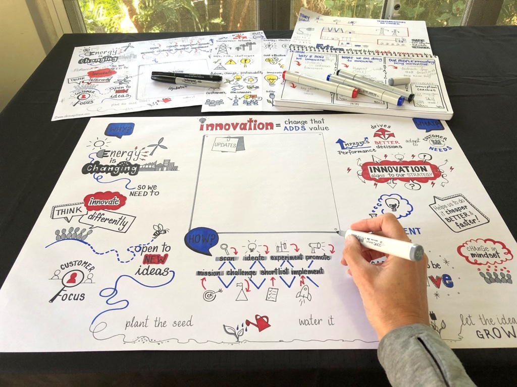
Illustrating Innovation
I illustrated a wall mural for Powerlink based on the feedback of their staff which I graphically recorded (ie. visualised into words and pictures live) and then drew out to create the BIG picture of their innovation story. The artwork is also a living mural as innovation ‘updates’ can be drawn onto the wall for all staff to see. Thank you to the team of people who helped this creative collaboration come to life. Below are photos illustrating the process of this wall mural:
Step 1: Graphically recording staff feedback on “innovation” at the Powerlink Open House Day


Step 2: Mock-up drawings based on a range of information including staff feedback and strategic input to create the visual story of innovation
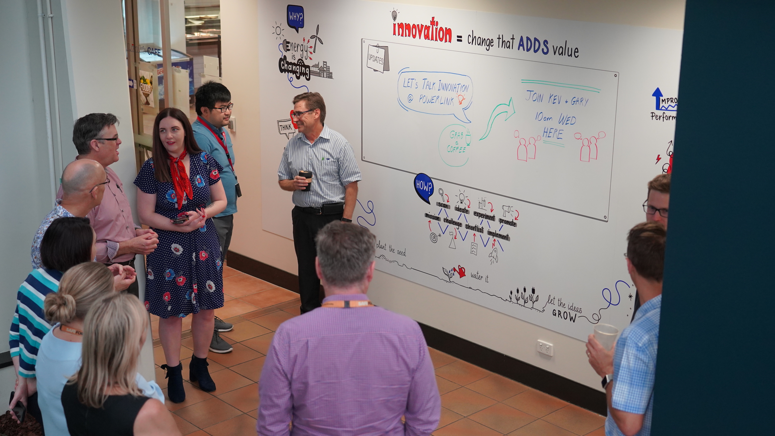
Step 3: The final visual story on the office wall which is also a living mural where staff can provide innovation updates for all staff to see
 A wonderful quote from a staff member, “It’s a great illustration – really gets you thinking every time you walk past (which for me is a lot of times each day)!“
The before and after wall:

Infographics:
Infographics are a powerful way of sharing your stories through words and pictures. My infographics are based upon your organisations/team/individual story and I have drawn out a diverse range of topics and issues from strategic plans, stakeholder input, science, regulations, community workshops, Indigenous knowledge, PhDs, publications and front covers, preparation for talks and workshop templates, illustrating Webinar/podcast content to action and inspiration walls for events and conferences. You can see examples of my hand-drawn infographics and illustrations below.
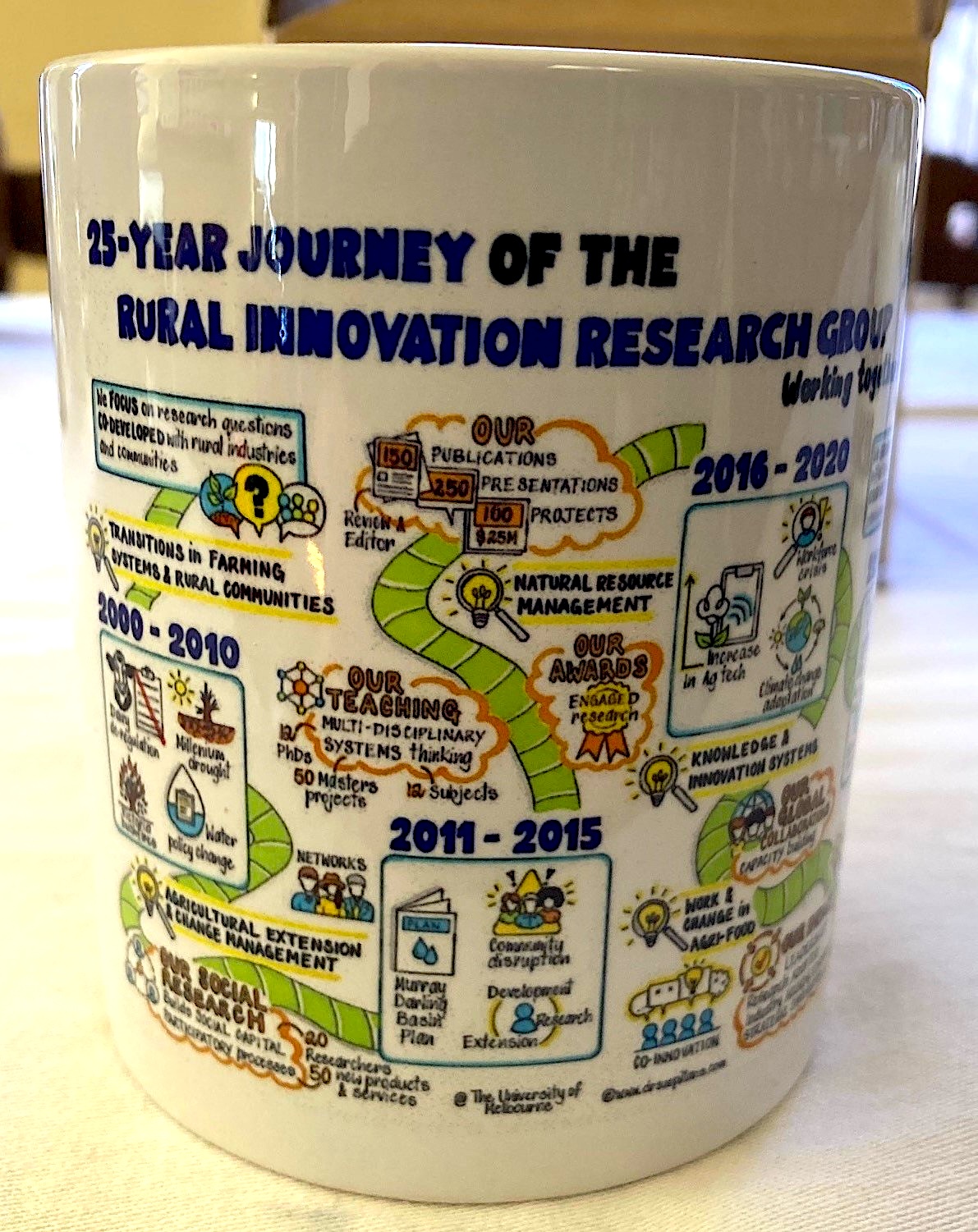
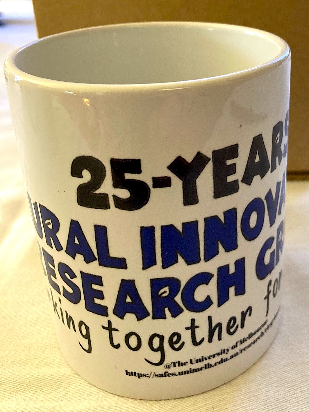
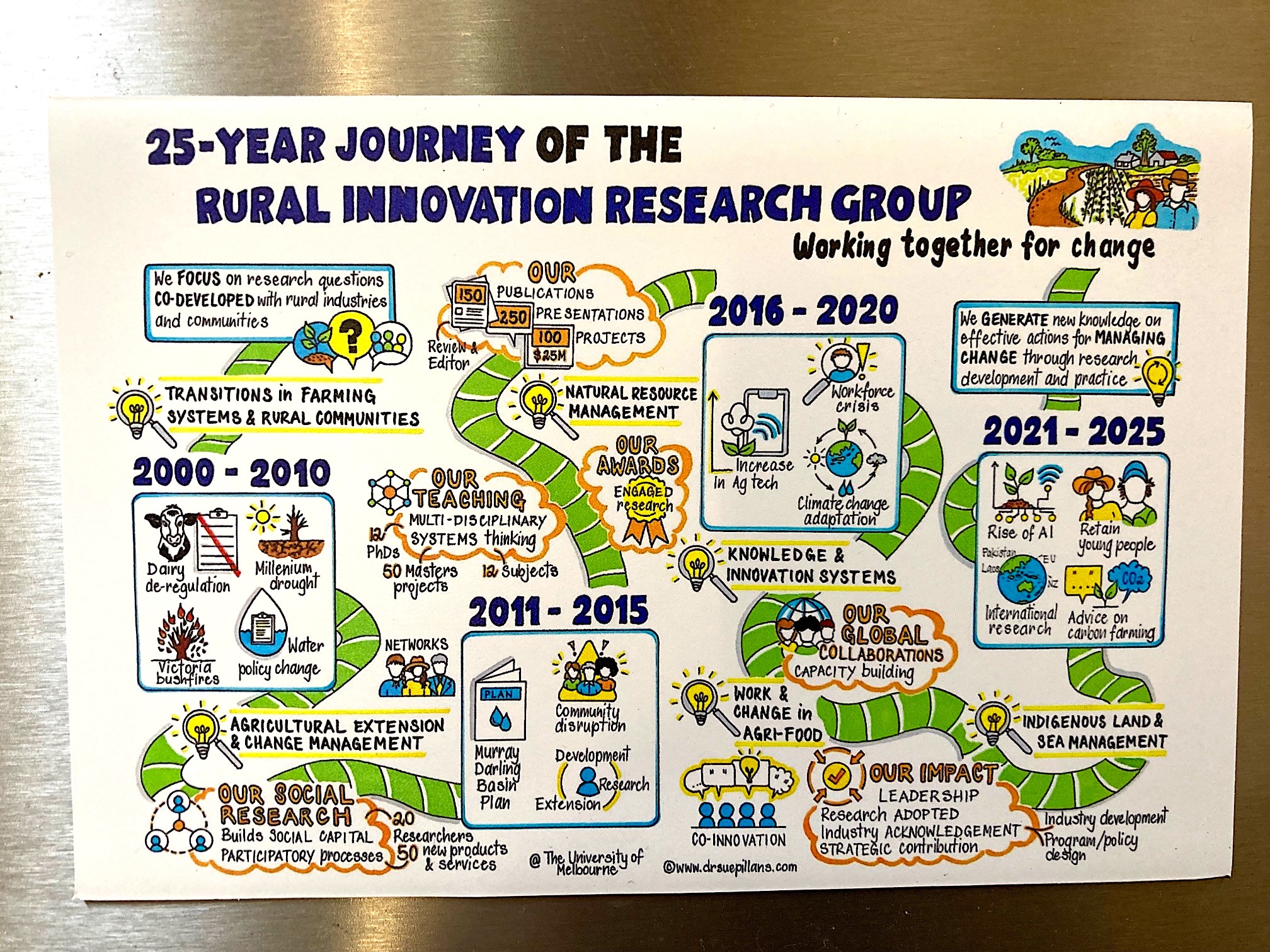
Celebrating 25 years!
THIS has to be the icing on the cake for me, literally! What a joy and a privilege to picture the 25-year journey of the Rural Innovation Research Group (RIRG) from the University of Melbourne!

I worked closely with Professor Ruth Nettle and her team to create a series of visual stories documenting and celebrating their 25-years of research. What an honour this was and what an absolute pleasure it was to work with Ruth and her team.
The aim of creating these visuals was to visually represent the work the RIRG team do, who they collaborate with and their impact over a 25-year period. So the following artworks were created:
- 25-year journey of the RIRG Team (big picture)
- RIRG team name designs (small designs)
- Tagline “Working together for change”

![]()
So these artworks could be used in a range of ways, on multiple platforms and used to create exciting creative visual products, they needed to be tailored to their audience, use and team needs. So this creative collaboration relied heavily on clear and regular communication with Ruth and the team and were created based on the following sources of information:
- Conversations with Ruth
- Recorded Zoom meetings with past and present team members discussing the key aspects of their RIRG journey
- Chronology of challenges the team research and education has responded to
- Strategic Plans
- Publication lists
- Research websites
- Past and present projects

And the feedback on this creative collaboration was amazing:
“Sue was a pleasure to collaborate with. From design ideas to completed artworks, Sue was professional, thorough and was a clear communicator throughout the process. It was so much fun to work with Sue and we are so pleased with our artworks which presents the 25 years of our research and work with rural communities and the agricultural sector in such vivid and creative ways”.
The artworks are not only being used on top of cakes to celebrate, but also the following:
- Conferences, as pull-up banners, in presentations
- Email banners and Powerpoint banners
- Online webinars
- Websites
- Face-to-face celebrations
- Reports, strategic plans, publications
- Posters
- Gifts (framed)
- Mugs
- Fridge magnets
- and snow globes!
Whilst the final visual stories may look ‘simple’ in nature, they were created based upon detailed information and team feedback, with much of my time reviewing, synthesising and translating the key parts of the RIRG team story to create a 25-year journey. That’s why I love using visual storytelling to help make the complex simple and the simple compelling.
Thank you to Ruth and the RIRG team for inviting me to picture your story. Congratulations on 25-years!

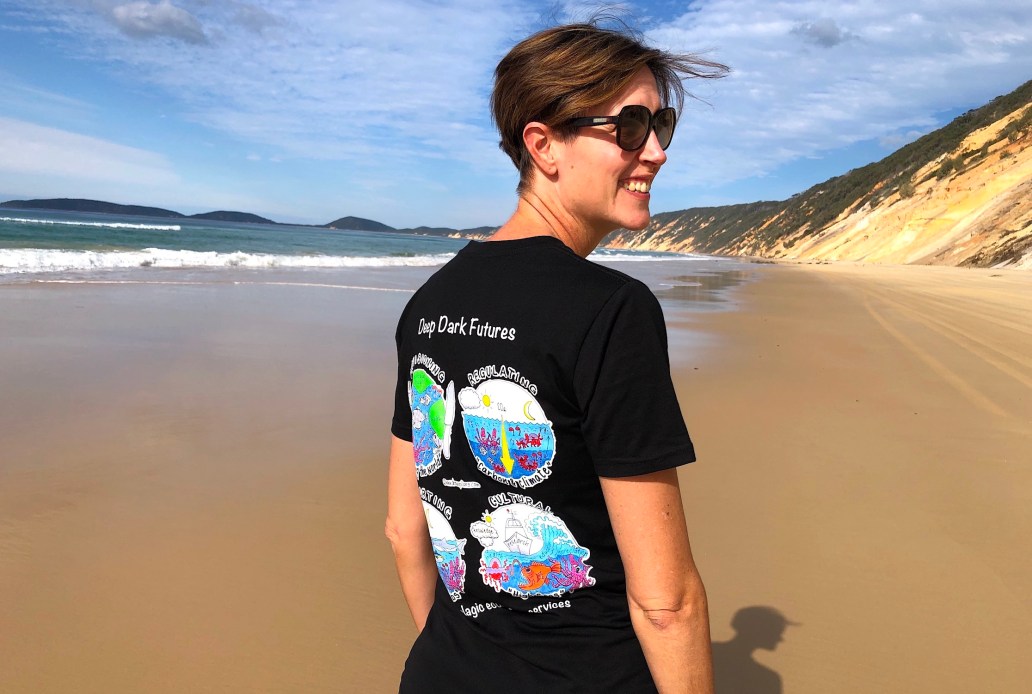
Drawing out Deep Dark Futures
As a marine scientist and artist it was a thrill to be asked by the CSIRO to create a series of future scenarios for “Deep Dark Futures” of the mesopelagic zone… which is the zone that extends from 200-1000m below the surface of the ocean. Also known as the “Twilight Zone”!

Creating this series of future scenarios was very exciting, as who doesn’t want the opportunity to draw out the wonders of the deep ocean! But it was also challenging due to the number and diversity of complex scientific concepts I was engaged to illustrate (for a targeted audience), along with designing visuals that provided positive and hopeful solutions for our deep oceans, which face some of the worlds most pressing challenges. These infographics became part of a Discussion Paper by the CSIRO AND were published in the Fish and Fisheries journal – which was so great to sea, as art really does make science clear!
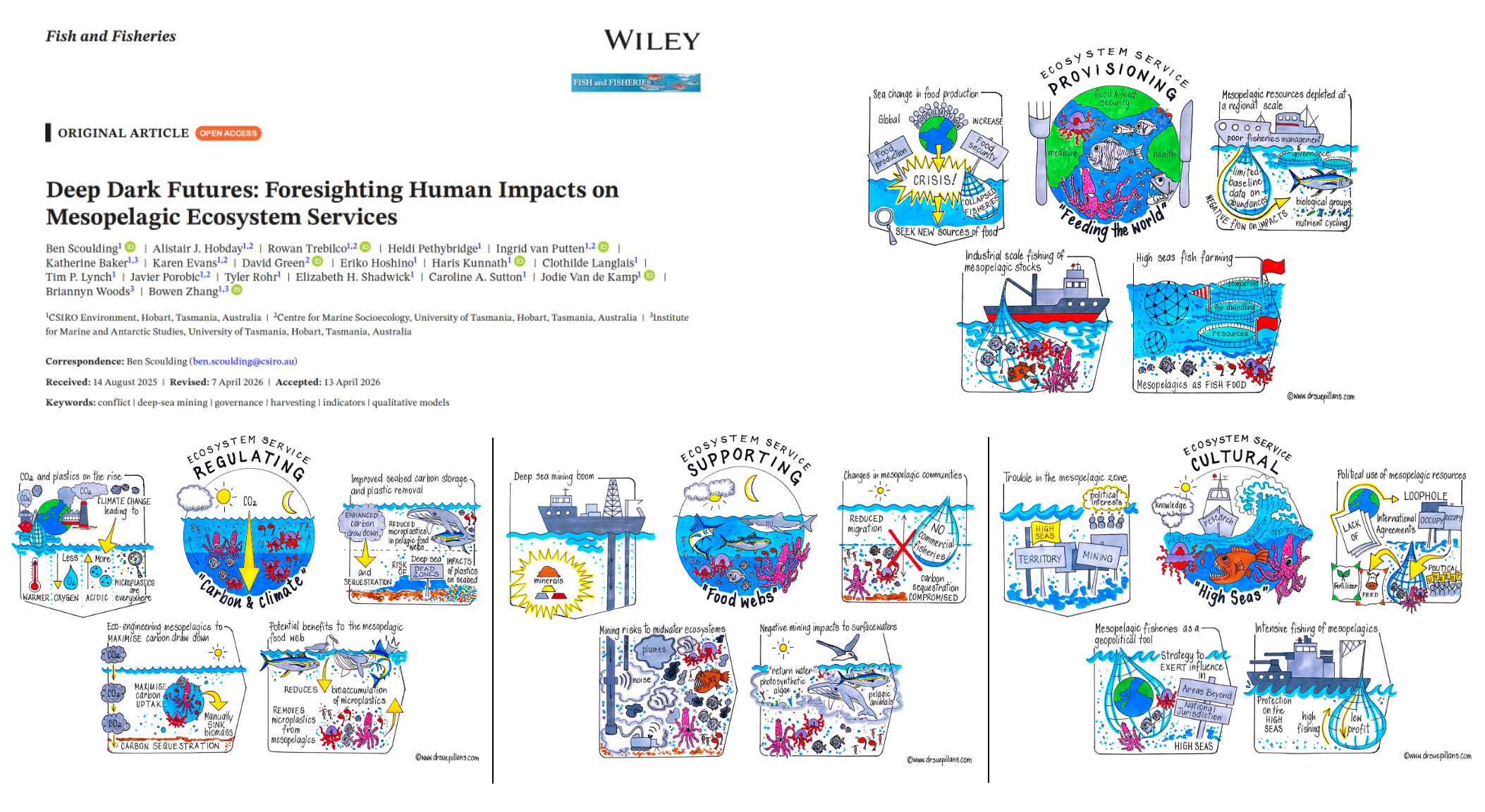


The team at CSIRO were so happy with how the scenarios were drawn out that they put the artwork on t-shirts and want to make our next drawing project a bit more challenging!

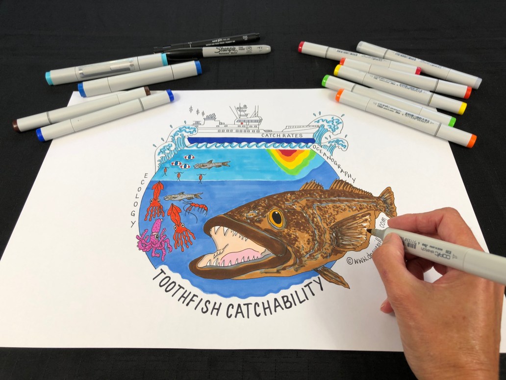
Patagonian toothfish
It’s not everyday you get asked to draw attention to Patagonian toothfish by the CSIRO! Patagonian toothfish support Australia’s highest value finish fishery. Due to their fisheries importance in Australia I have been creating a tailored infographic for the research team who are looking at investigating the relationships between oceanography, toothfish prey fields and catch rates in the Southern Ocean.
This research project included some particularly sophisticated modelling techniques and oceanographic models to provide the fishing industry and managers with an understanding of the environmental, ecological and economic drivers of toothfish fisheries. So what an exciting project to draw attention to! It was a great experience creating this infographic which challenged me at times to ensure that I was illustrating all of the important factors of this research project for the targeted audience, the fishing industry and managers.
I loved creating this science illustration AND just wait and ‘sea’ how this artwork is being used by the CSIRO!

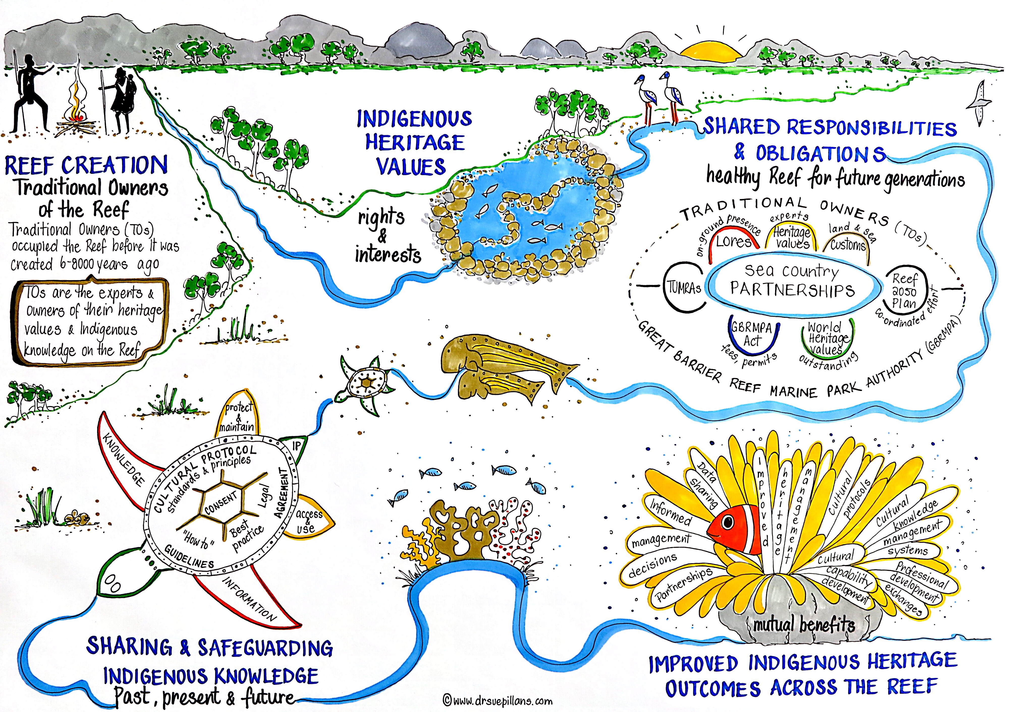
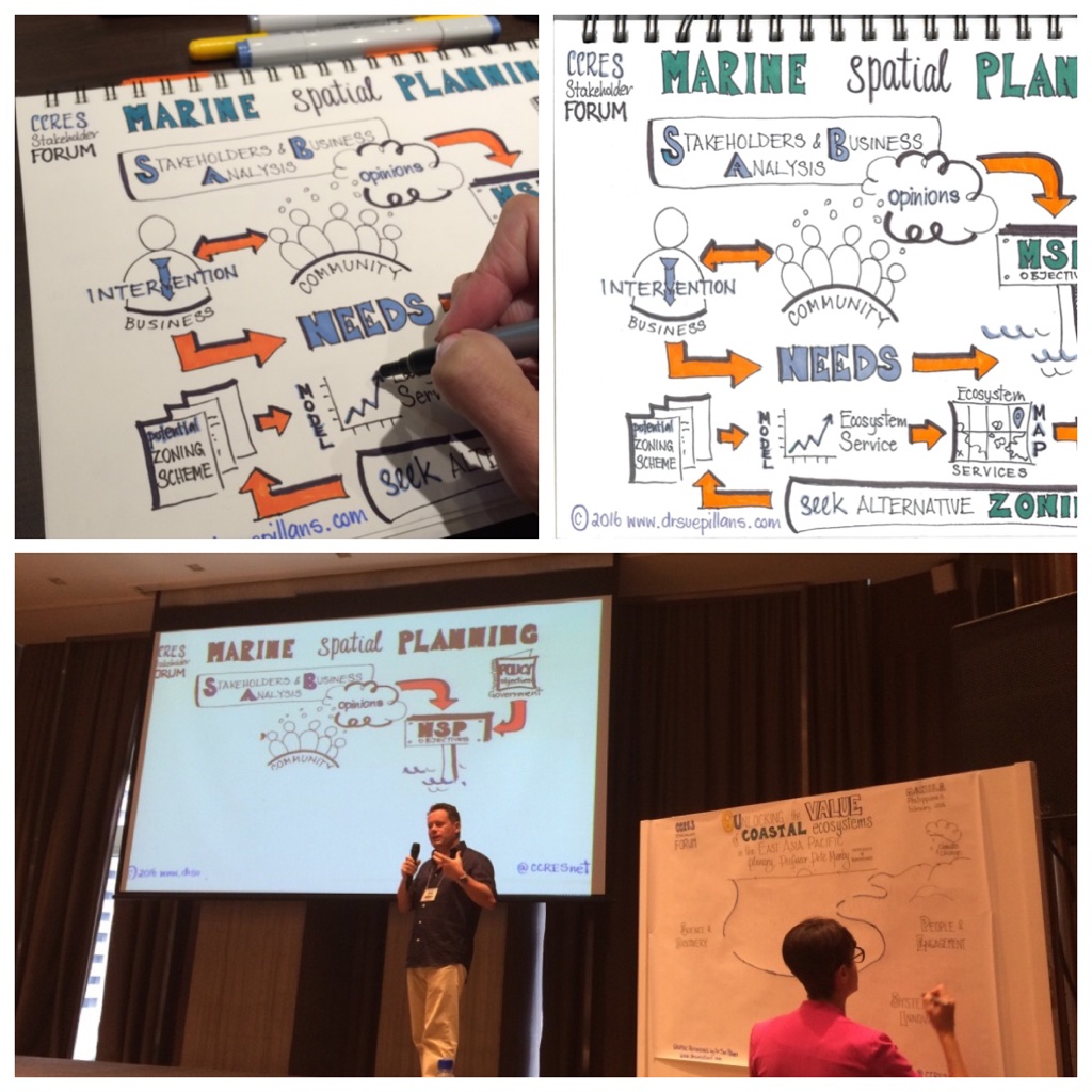
Traditional Owner RIMReP journey
I was engaged by the Great Barrier Reef Marine Park Authority (GBRMPA) to co-create an infographic to picture the important story of the Traditional Owner (TO) journey through the Reef 2050 Integrated Monitoring and Reporting Program (RIMReP). GBRMPA wanted to increase Traditional Owner awareness and understanding about the RIMReP, how it will support improved protection and management of the Reef and the various ways Traditional Owners can be involved in RIMReP.
I was able to discuss the creation of this important story with Traditional Owner members who advise GBRMPA/RIMReP on how best to engage, provide their own perspectives on the program and its outputs and outreach with community. I co-designed this illustration with the TOs and the RIMReP team as a journey to help explain what RIMReP is, what is planned over the next 5+ years and where TOs can get involved through their sea country monitoring and management.
This artwork is now being used to communicate the TO RIMReP journey with stakeholders through regional forums and workshops and discussions with communities.
It was a great pleasure and privilege to be asked to create this important illustration.


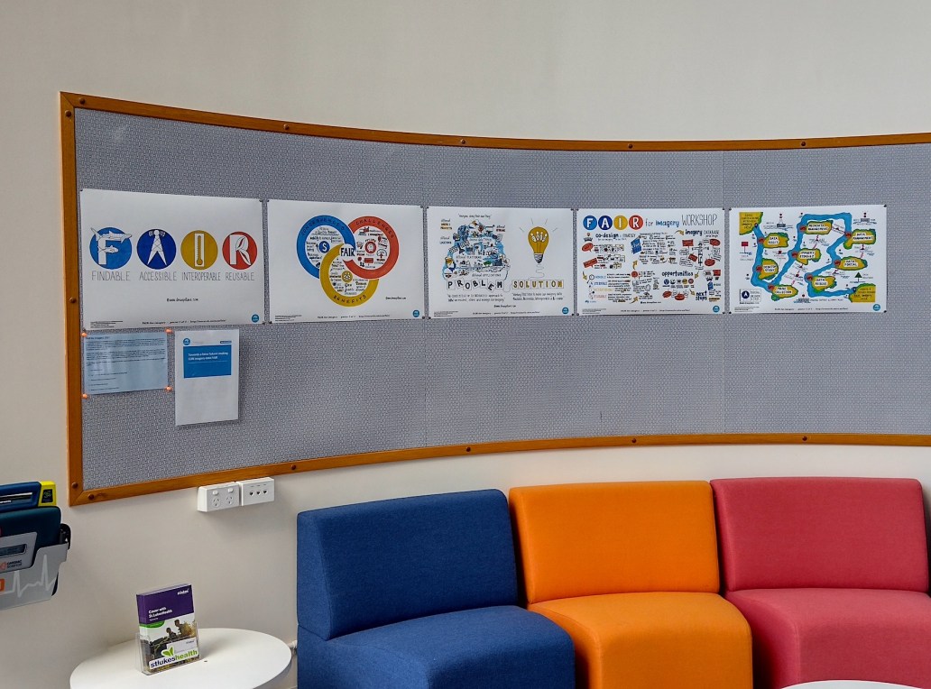
FAIR data at CSIRO
After graphically recording live the CSIRO Coasts & Oceans Research FAIR (FAIR – Findable, Accessible, Interoperable, Reusable) Workshop I was engaged to create a series of infographics to be included in an internal strategic Blue Paper. These ‘illustrated’ the importance of FAIR data based on staff input and I really enjoyed working with the team, particularly being able to create my own marine alphabet!
AND the works of art now hang on the walls of CSIRO for all to ‘sea’!

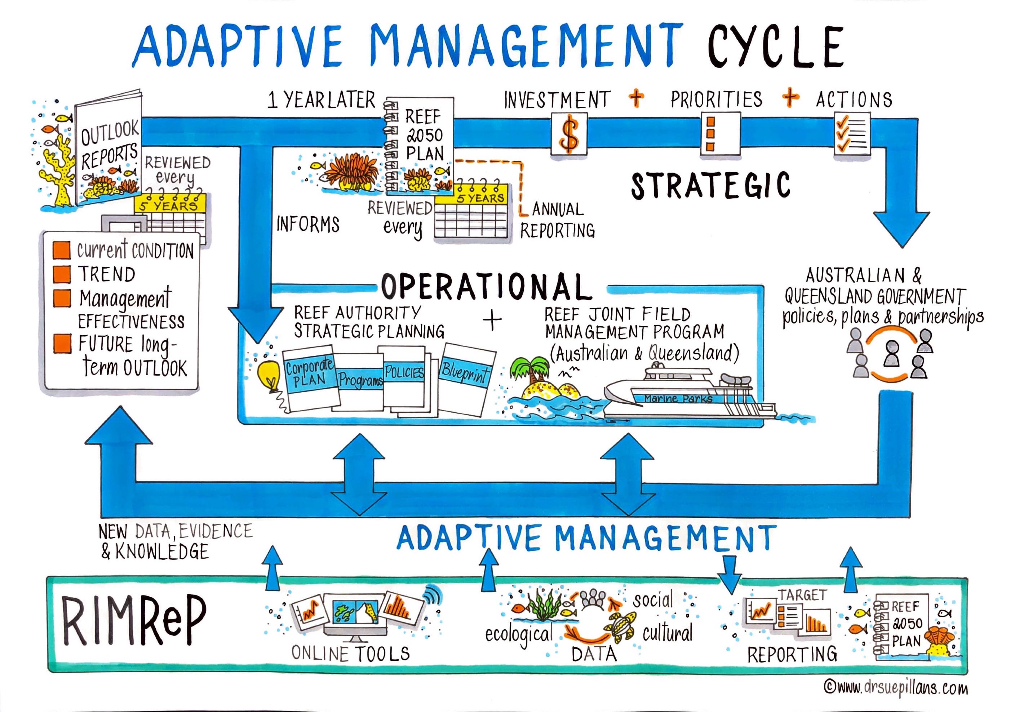
Adaptive Management Cycle
Being able to picture how your policies, processes and procedures interact and flow within an organisation is a powerful way to communicate to your staff and colleagues how and why you do what you do. So it was a great pleasure getting to work with the Great Barrier Reef Marine Park Authority again to create an infographic which pictured their Adaptive Management Cycle regarding the Outlook Report and associated strategic and operational programs.
This illustration was created for staff and colleagues, so it was important that the infographic was created with the audience in mind. To that end, even though this cycle is a complex one, I tried to ensure that the look and feel and flow of the illustration were simple and clear to the eye. I hear that the artworks are now on staff desks and some of them are even framed works of art!!

AND as you can ‘sea’ the artwork has also been presented on the BIG screen at the AMSA 2022 Conference, which created quite the buzz for the Conference participants sending me images like this live from the presentation by the Great Barrier Reef Marine Park Authority!

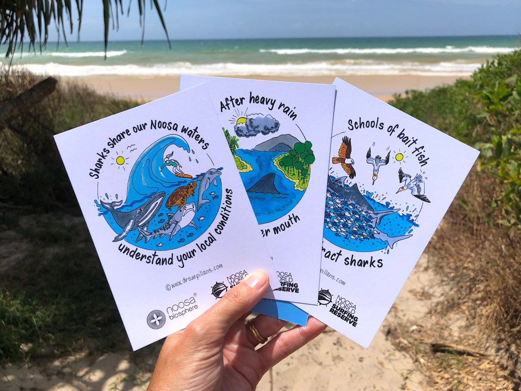
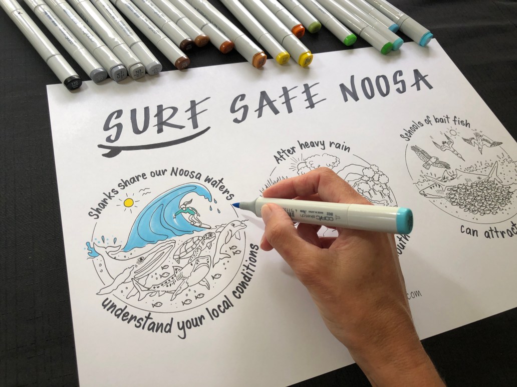
Surf Safe Noosa
It was a great experience working with Queensland Fisheries and the Noosa World Surfing Reserve (Noosa Biosphere) who engaged me to create an infographic which would deliver surf safety messages about reducing the risk of shark bite in a way that resonated with the audience (ie. surfers) and the place (Noosa) – for the Surf Safe Noosa campaign. I created an infographic that told a story about the different conditions to look out for when surfing at Noosa, including the important message that sharks share Noosa waters.
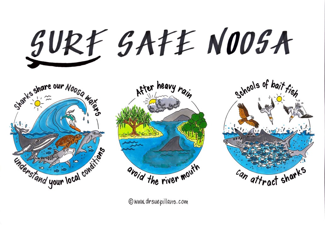
This visual was designed as both a ‘big picture’ story and so each picture could be used individually. The key messages were then made into postcards to be made available to the public, surfers and visitors to Noosa; now available at Tourism Noosa Visitor Centre and local surf stores.
The Surf Safe Noosa campaign was designed to help surfers understand the local conditions and stay safe in the water. You can ‘sea’ more about this important project at Surf Safe Noosa. All Year Round

International Congress for Conservation Biology
How do you ENGAGE and EXCITE your workshop participants? I use the power of visuals to help people to picture their ideas, literally!
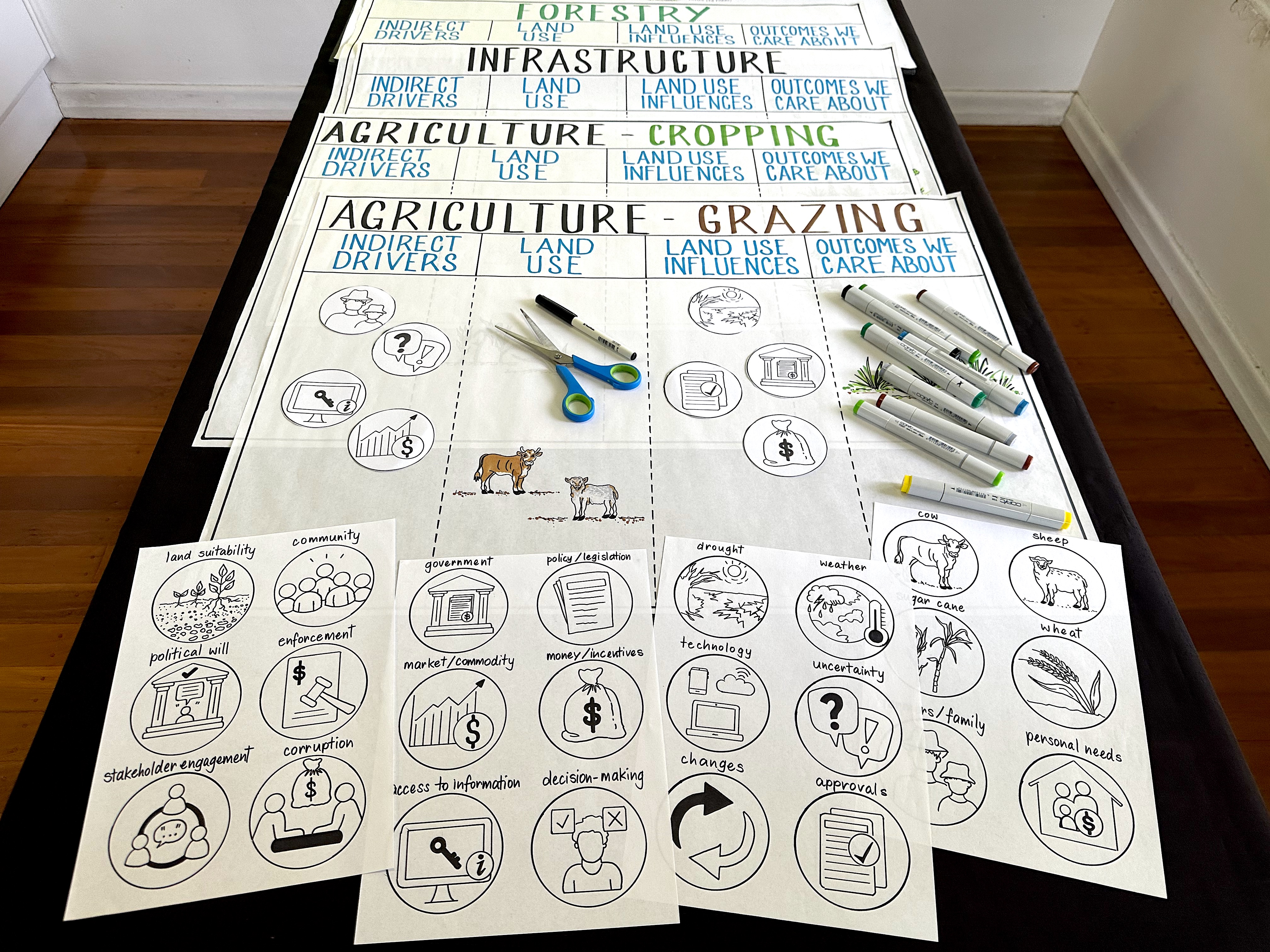
I created a series of visuals to help workshop participants to picture “What is driving land clearing in Australia?”, hosted by the dynamic duo of Dr Victoria Graham and Professor Vanessa Adams of The University of Tasmania at their workshop held at the International Congress for Conservation Biology.
![]()
In preparation for the workshop I worked with Tori and Vanessa to create a series of tailored visuals which workshop participants could use to draw out their stories of land clearing. This planning and preparation required rapidly acquiring knowledge about land clearing research across the different sectors, understanding of the emerging results from a three-stage expert elicitation process examining the drivers of land clearing, synthesising the information and then translating the key elements into useable workshop templates and easily recognisable icons.
This visual toolkit included:
✏️ 20+ icons
✏️ 4x large templates
✏️ Graphic recording of the workshop
And it was SO great to see the attendees using the visuals at the workshop to quickly illustrate the complexity and multi-dimensional nature of drivers influencing land clearing in Australia.
So instead of using reams of butchers paper and ‘death by powerpoint’, why not use tailored visuals at your next event to help engage your audience and make workshops creative, interactive and FUN!

You can also see the graphic recording I created of this important workshop over at my Graphic Recording for Schools and Universities
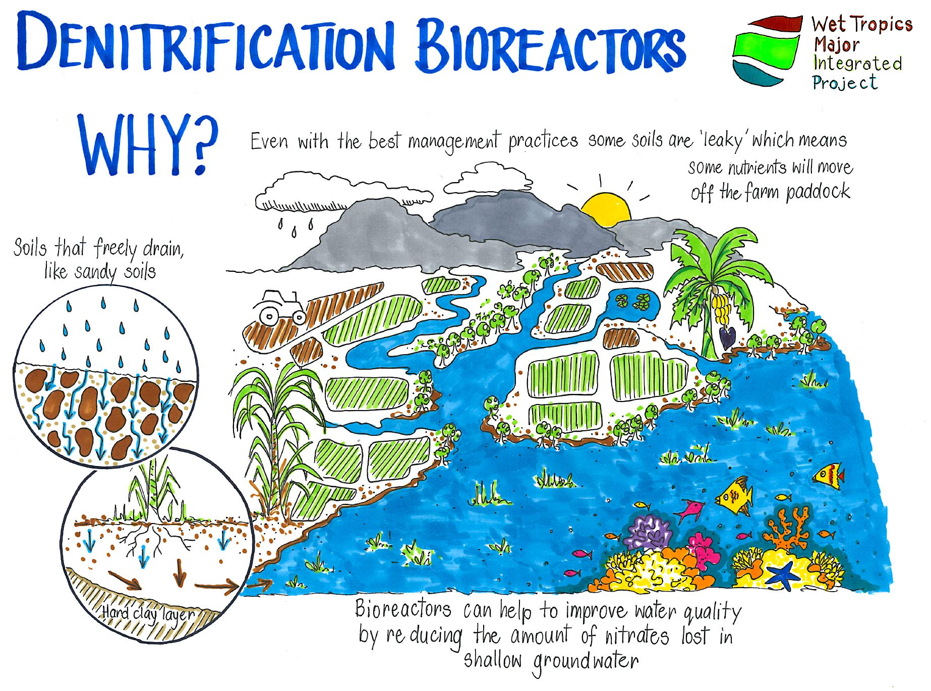
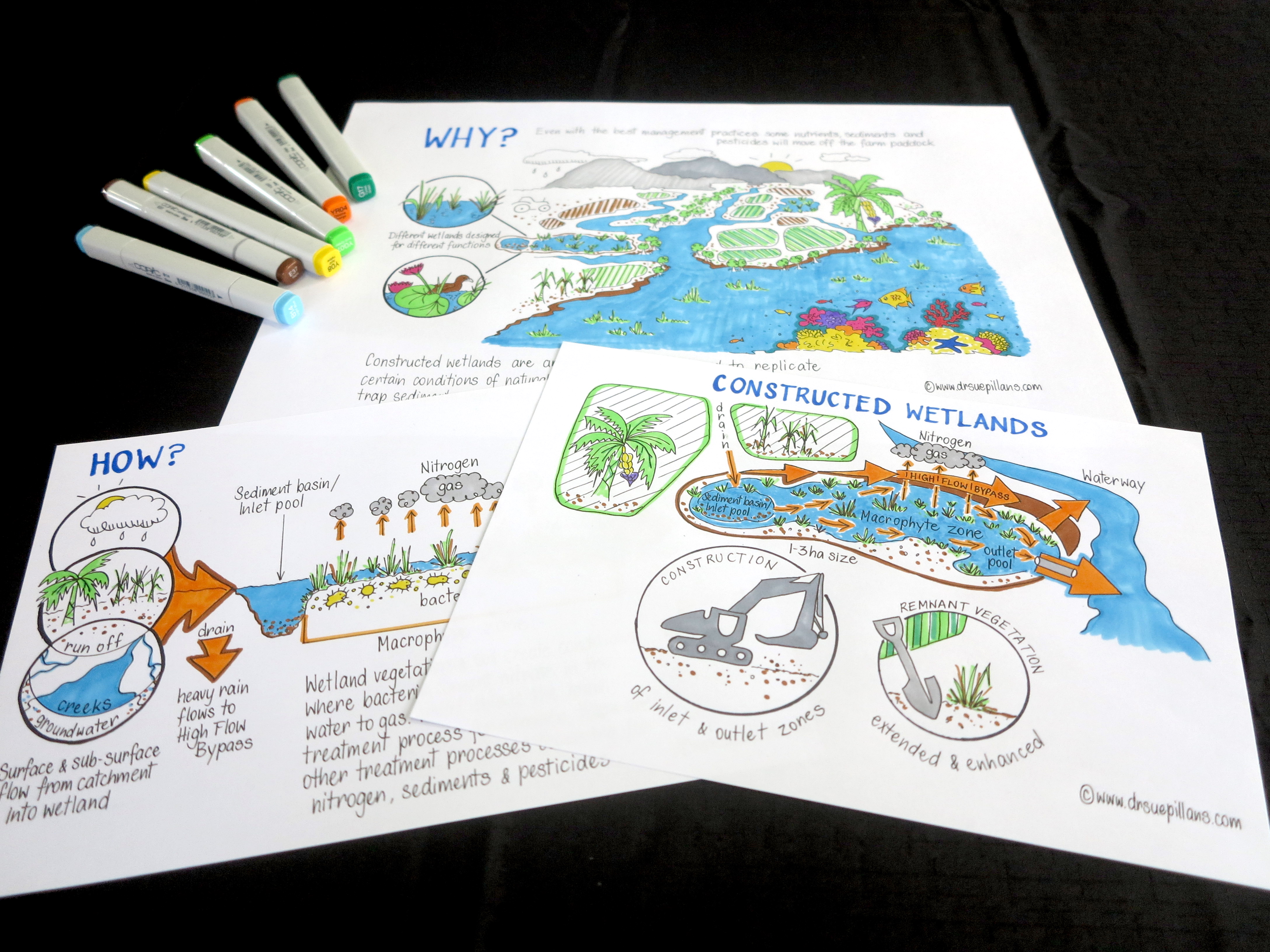
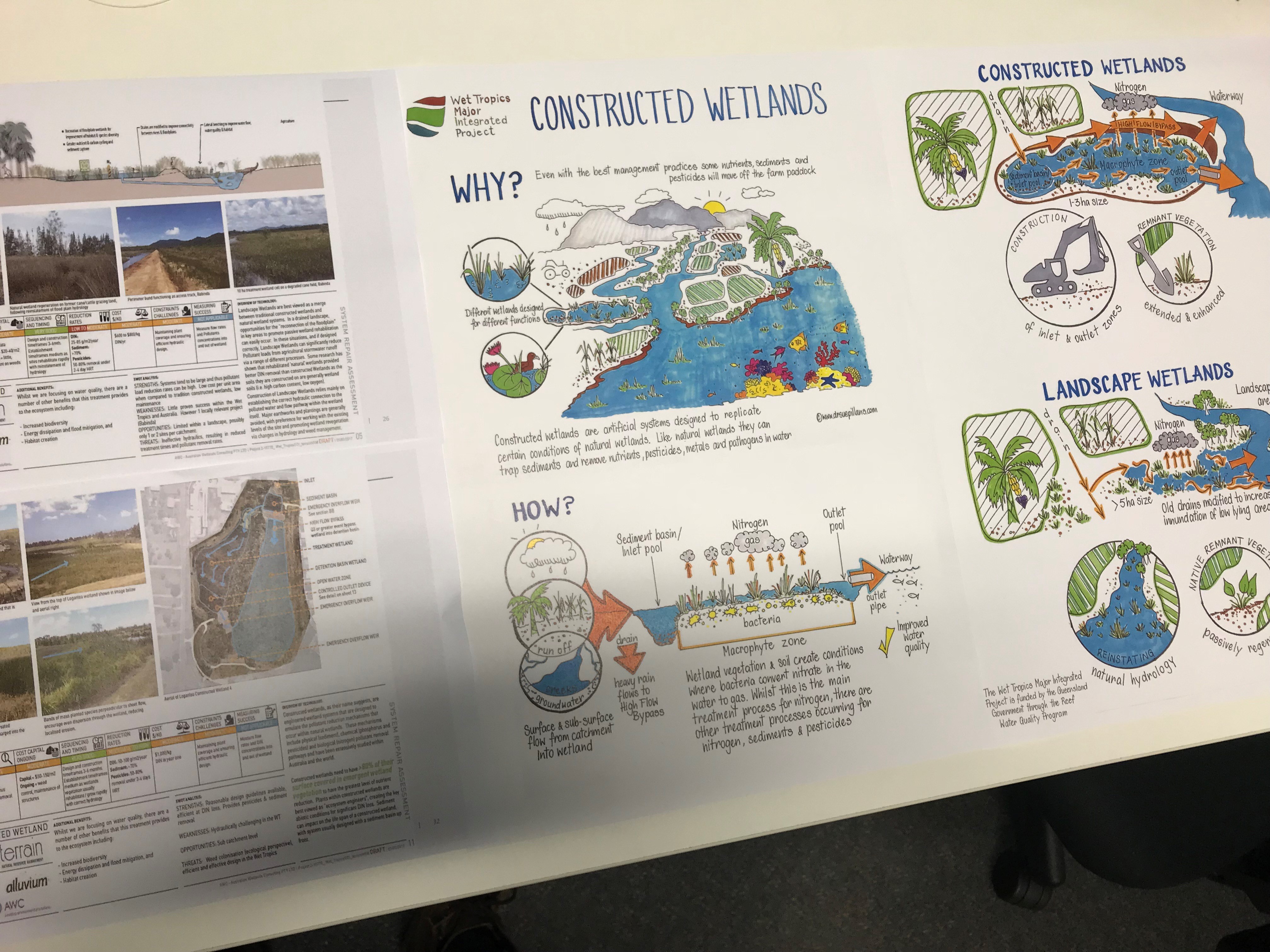
Water quality and the Great Barrier Reef
It is a great pleasure working with Terrain NRM to help them illustrate the important new ways Wet Tropics farmers in Queensland are working to improve the health of the Great Barrier Reef (as part of the Wet Tropics Major Integrated Project). This creative collaboration involves me drawing out the following catchment repair technologies which are then transformed into fact sheets for farmers:
- Denitrification Bioreactors
- Constructed Wetlands
- High Efficiency Sediment Basins
Denitrification Bioreactors The first in the series of fact sheets for farmers is bioreactors and the denitrification process, an on-farm technology for removing dissolved inorganic nitrogen from water. Catchment repair technologies like this are being implemented as part of the Wet Tropics Major Integrated Project.
As you can ‘sea’ from the photos below the creative collaboration to create drawings for complex issues such as this is a staged approach which includes me: interpreting the complex information and science presented, creating the mock-ups, illustrating the information in black and white and finishing up with coloured illustrations — which are then turned into informative infographics! I really loved ‘drawing attention’ to this very important work.


Constructed Wetlands The next in the series of catchment repair technologies that I am drawing out for Terrain NRM is ‘Constructed Wetlands’. Constructed Wetlands can trap sediments and remove nutrients, pesticides metals and pathogens in water.

High Efficiency Sediment Basins The last in the series of catchment repair technologies that I am drawing out for Terrain NRM is ‘HES Basins’. HES Basins can stop coarse and fine sediment and associated nutrients and pesticides from entering waterways like the Great Barrier Reef.


Illustrating Webinars, Zoom calls & Online chats
As we are using online platforms more and more to share our stories and discuss our ideas tailored infographics and illustrations can help to synthesize and simplify messages, elevate discussions and engage with audiences. To help improve Powerpoint slides (or alike) for Webinars, Zoom calls and online chats I have been working with teams and organisations to illustrate presentation content to help replace all the text, as a picture paints a thousand words!
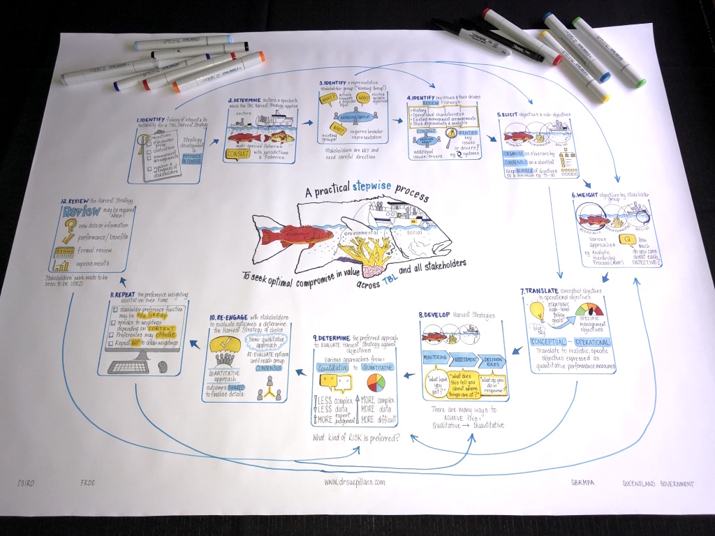
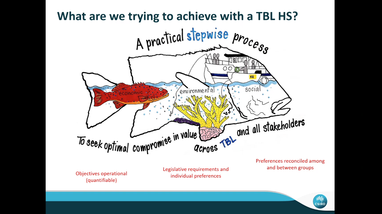
A General Methodology for Triple Bottom Line (TBL) Harvest Strategy Development
Below are examples of how I created an infographic for a CSIRO webinar which summarised a large Powerpoint presentation in which each of the steps were also drawn out and then used throughout the webinar. Thanks to Natalie and the team for having me along to help “Picture your presentation“!

The images below show how the final infographic was used throughout the Webinar presentation, from using the central theme and each of the steps in the process to presenting the final process. By drawing out each of the steps in this process the infographic can then be used in so many different ways to help engage with stakeholders, including using the individual elements and overall process in reports etc.


Code of Conduct
A Code of Conduct is an important and mandatory part of running organisations, so it was a great experience for me to illustrate the importance of an organisation’s Code of Conduct through words and pictures. Whilst not an easy task, as each picture needed to be created to provide clear understanding, care and a sense of positivity, even when some of the content can be quite sensitive in nature.


Illustrating organisational purpose – what’s your WHY?
It is always a great privilege to be asked to draw out an organisation’s strategy to illustrate their WHY. And working with TierraMar to create their visual story was a great experience and I loved creating the BIG PICTURE of their important story.

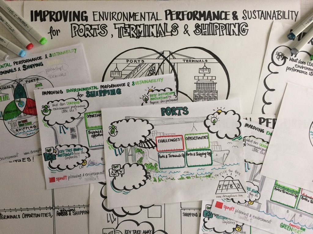
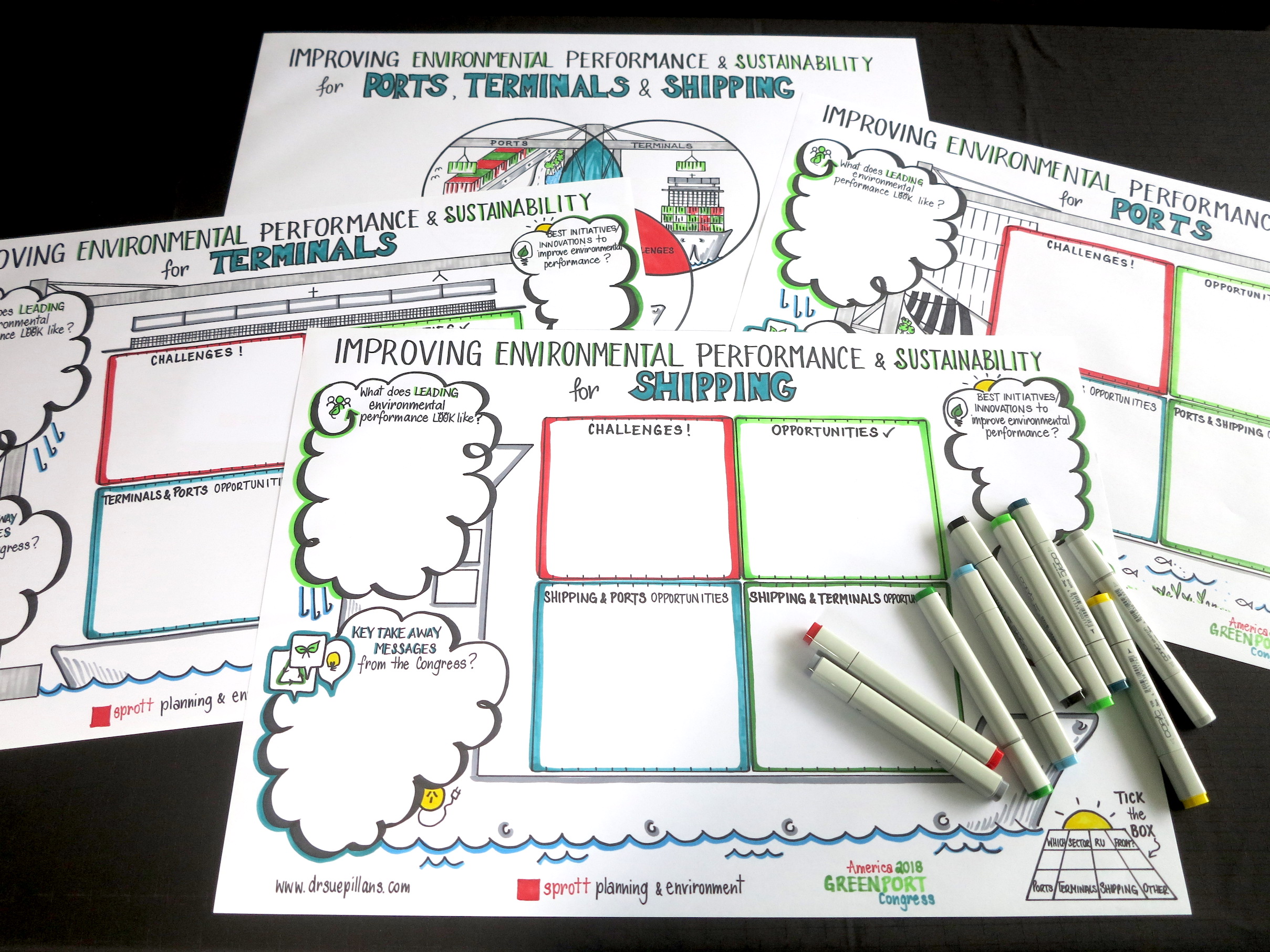
International Conference Workshop Templates:
It was great to be engaged by Sprott Planning & Environment to create some unique templates for the 2018 American GreenPort Congress. My clients are hosting a workshop at the Congress and wanted to engage participants with templates that would be visually appealing and gather their feedback without using the ‘usual’ butchers paper exercise! As you can ‘sea’ the creation of these templates is a staged process working from the initial discussion with my clients through to the creation of mock-ups and then the black and white drawings to the FINAL coloured templates!


Proposals and presentations:
It’s always a great delight for me as a marine scientist to be able to illustrate concepts and information to help managers and stakeholders of our marine resources. Here is a sneak peak of some drawings I have created for a proposal and presentation to help picture the importance of protecting marine biodiversity and managing fisheries in The Coral Triangle.

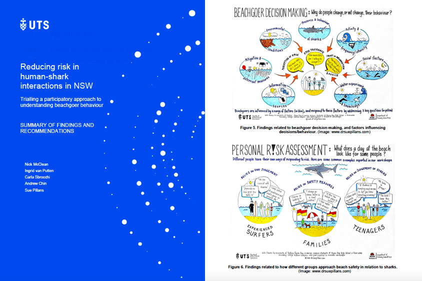
Community shark management workshops
I was part of a research team carrying out community workshops along the NSW coastline for the NSW Department of Primary Industries to ‘draw out’ beachgoers behaviour regarding sharks. This project focused on “Reducing risk in human shark interactions in NSW: a participatory approach to management and planning“. As a graphic recorder I created visual stories live at community and school workshops to picture ‘Have sharks changed your beach experience?‘.
Following the workshops I created visual stories to illustrate the key findings and conclusions of the research. These visual stories help to draw out the community’s feedback regarding beachgoer behaviour and sharks, as well as provide visual posters for the community groups who participated in this research project so they can ‘sea’ themselves in the picture. You can ‘sea’ the summary of the findings and recommendations in the Summary Report and you can see more about picturing this research project at https://drsuepillans.com/recording/schools-universities/


Digital Circular Food Economy:
It was great getting to create a range of artworks for the ‘Digital Circular Food Economy’ project for the Queensland University of Technology (QUT). This was a creative collaboration carried out over many months to illustrate the Why & How of this 3-year project. A time-lapse video (below) was also created to illustrate the story behind this project and you can see more at https://research.qut.edu.au/circular-food-economy/

Client testimonial: “ I am totally in awe of Dr Sue Pillans and how she helped bring our ‘digital circular food economy’ project to life. Some of the concepts we wanted to communicate to a non-scientific audience were complex, and Sue was able to coax out our ‘science story’ before creating the most incredibly beautiful and engaging art work. She has unique skills in science communication through art – it means we can reach a wider audience and inspire the with beautiful, original artworks”, Associate Professor Carol Richards, Food Systems, Business School, QUT
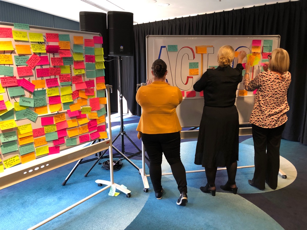
Action and Inspiration Walls:
It was great to create these simple but very effective Action and Inspiration Walls for a big Conference. These ‘action walls’ were built into the Conference Agenda as a series of group work exercises carried out throughout the day to help inspire ideas. As you can see there were A LOT of inspired ideas for strategy, action and imagine if!

Infographics for publications & presentations:

 A series of infographics created to illustrate Indigenous Heritage Values in the Great Barrier Reef Marine Park to be used in Fact Sheets with Traditional Owners and stakeholders (as below).
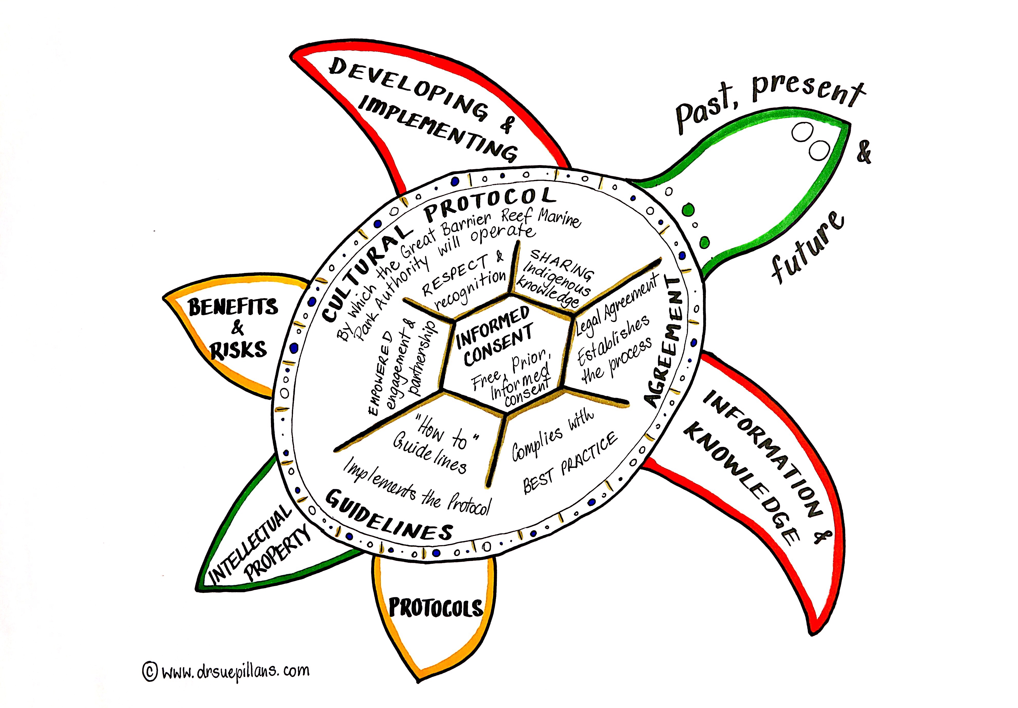


Drawings for PhDs, talks, preparations, websites and more!


Icons for websites

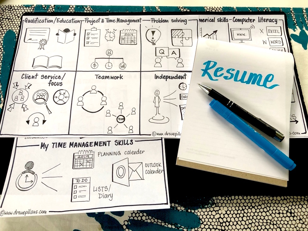
Icons & scenarios for Resumes & Interviews
Create your own visual BIO!

This is a visual biography I created for myself to illustrate the visual communication services I offer. FUN to ‘sea’ and visually appealing!
Listening to interviews/podcasts

Conference and workshop illustrations (created on site)

Hand Drawn Animations:
As hand drawn animations take a considerable amount of time to create with clients this type of visual storytelling needs to be booked many months in advance as I only create a handful of these animated stories per year. The example below was created using an iPad, which I don’t use anymore as I prefer hand drawn visuals, but it gives a good example of how you can use visuals and audio to bring your story to life.
Sustainable Sediment Management Story (North Queensland Bulk Ports)
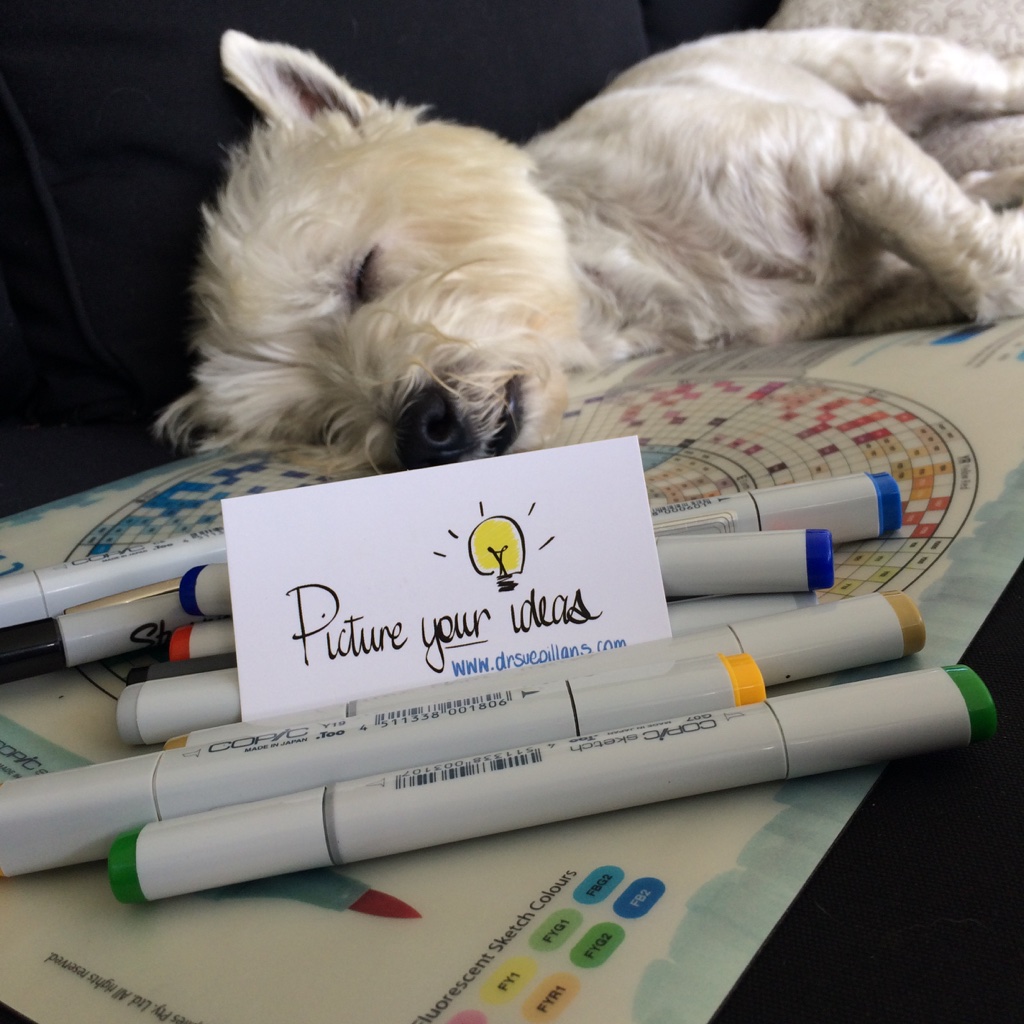
Each of my drawings are created in some way with the “help” of my pawsome creative companion! Miss you Mr Fergus.
*Please note the use of my graphics and visuals need to be attributed to me and remain unaltered unless written permission is given as all graphics, images and video’s are Copyright © 2026 Dr Sue Pillans
For more information about my Infographics & Illustrations please 
